QQAA
Website design
Development
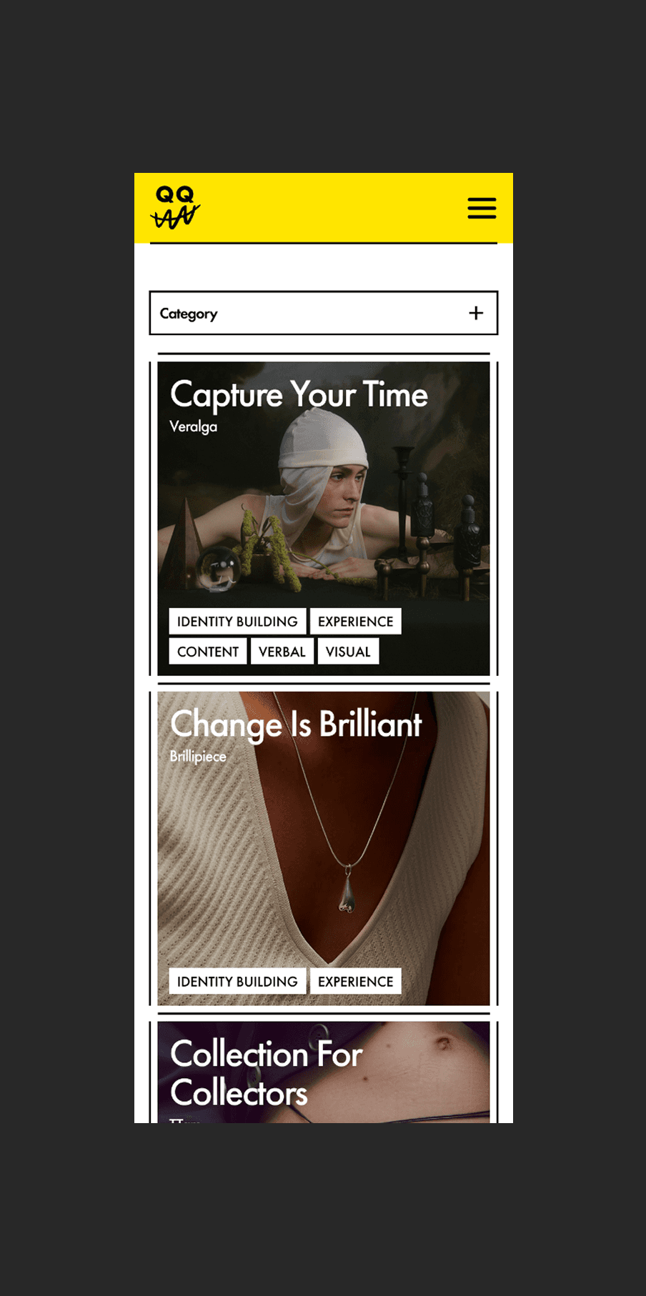
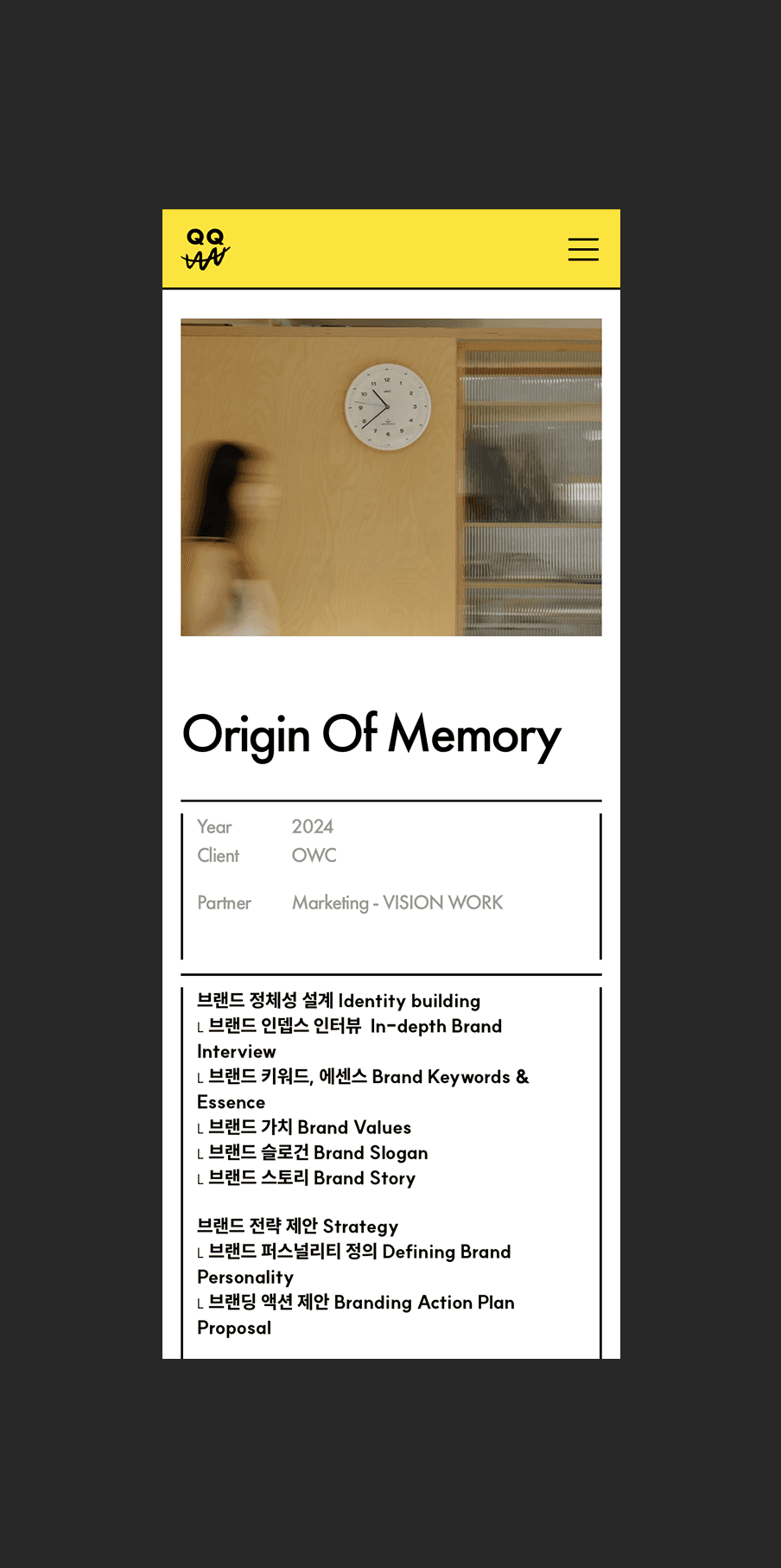
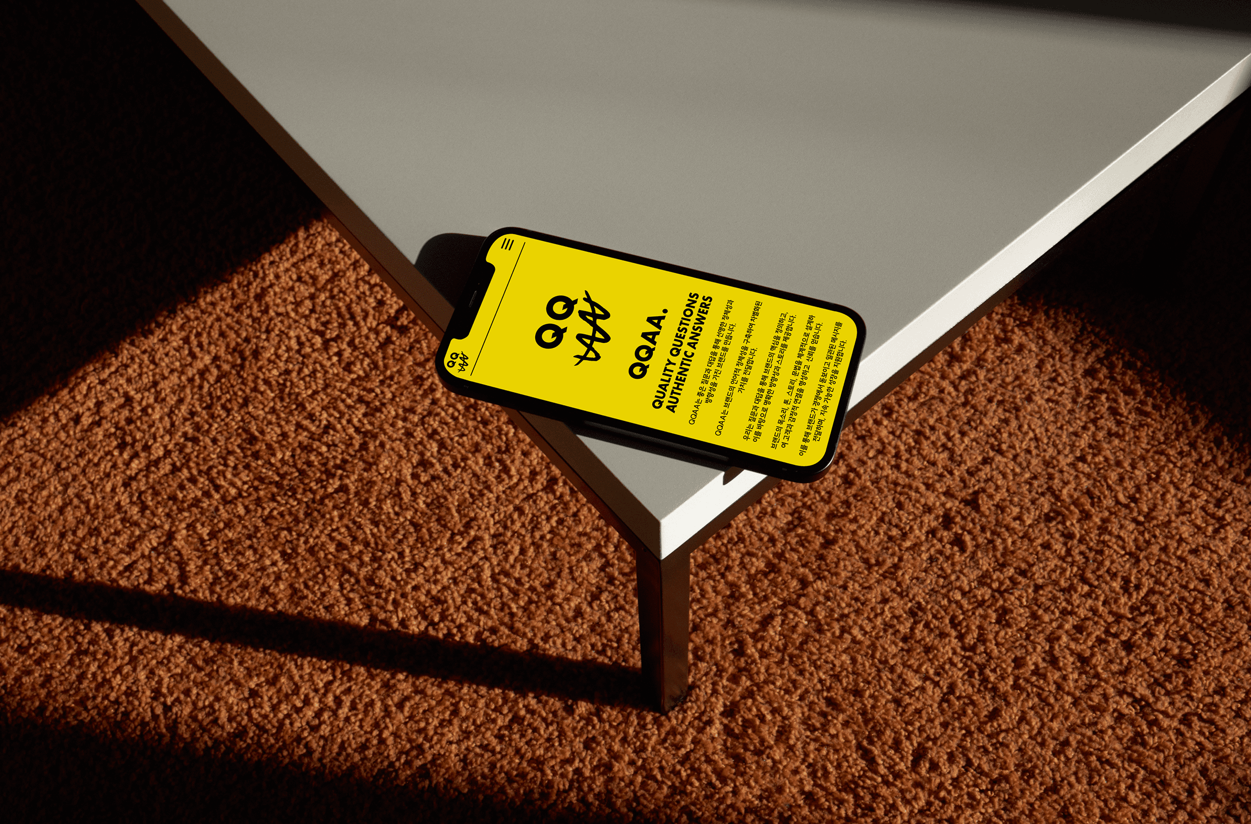
QQAA는 언어를 통해 브랜드의 가치를 전하는 버벌 브랜드 컨설팅 팀입니다. 우리는 그들의 철학과 아이덴티티가 디지털 환경에서도 일관되게 느껴질 수 있도록 웹사이트를 구현했습니다. 강한 타이포그래피와 포인트 컬러인 옐로우는 QQAA가 지닌 자신감과 명확한 언어를 시각적으로 표현하며, 이미지보다 문장의 힘으로 이야기를 전하는 그들의 본질을 그대로 담아냅니다. 화면 전면에 자리한 브랜드 슬로건은 QQAA의 세계로 사용자를 자연스럽게 이끄는 시작점이 됩니다.
QQAA is a verbal brand consulting team that gives meaning to brands through language. We designed their digital presence to reflect the same clarity and philosophy that define their identity. Bold typography and the signature yellow color express QQAA’s confident voice, capturing a brand that communicates through words rather than images. Positioned at the forefront, the brand slogan becomes the first touchpoint — a quiet invitation into QQAA’s world.